Ascii UI -> pixels UI
I'm continuing to port my UI to the pixels backend:
Before: 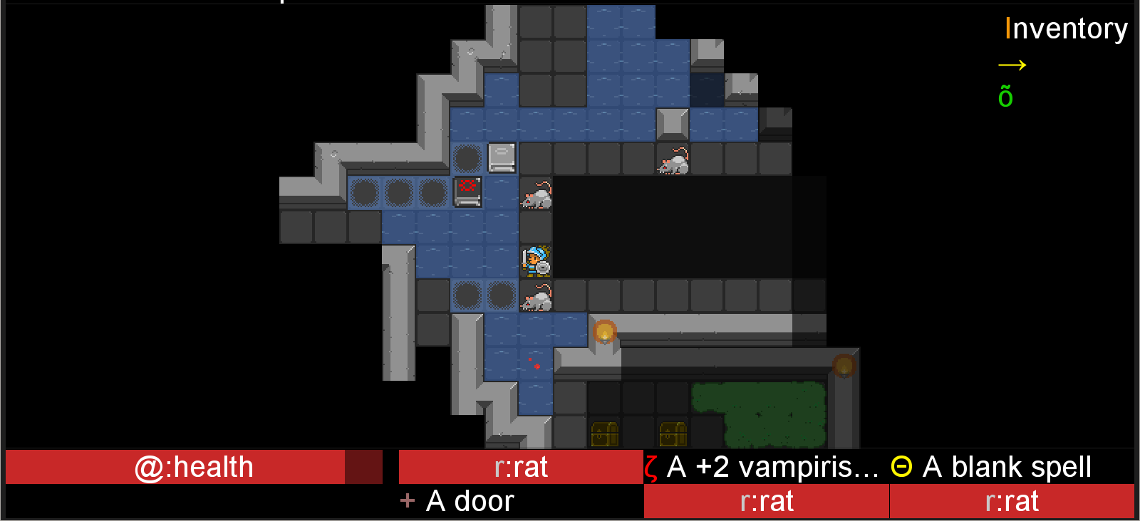
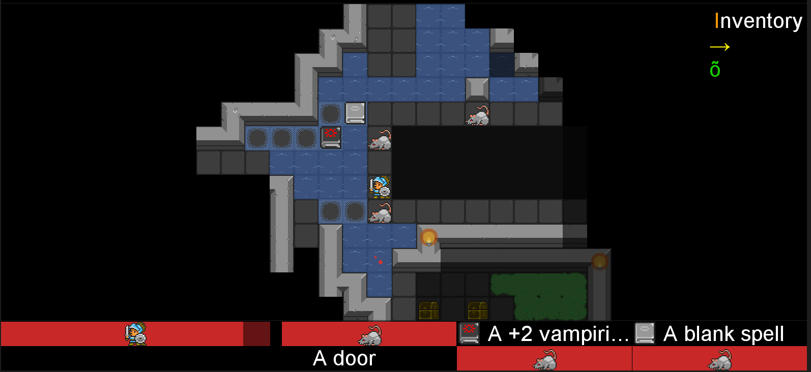
After (look at the bottom):
❤ to new followers (and old timers too obviously!)
I'm continuing to port my UI to the pixels backend:
Before:
After (look at the bottom):
❤ to new followers (and old timers too obviously!)
Modern ASCII roguelike - Can your mercenary beat the dungeon ?
| Status | Released |
| Author | smelc3 |
| Genre | Role Playing |
| Tags | ascii-art, Difficult, Dungeon Crawler, Fantasy, Perma Death, Procedural Generation, Roguelike, Singleplayer, Strategy RPG, Text based |
| Languages | German, English |
| Accessibility | Subtitles |
Comments
Log in with itch.io to leave a comment.
I would vote for keeping enemy names next to their sprites (same way items kept their names). Torches look cool!
Interesting! I plan to put this "what you see bar" vertically afterwards, to the screen's right; that is why I removed enemy names: when it will be vertical, width will be reduced. Do you come from an "ASCII" roguelike community ? I wonder if more "classical" gamers would like to keep the text too.
i agree that you should keep the monsters name
i'm a classical gamer, your game is the only ASCII i have ever played
and you should show the icon for everything else (on this image the door doesn't show the icon)
btw, what's the expectancy for next release?
I can play ASCII roguelikes and have a lot in the past (mostly pre-dcss versions of Crawl and Dwarf Fortress till this day), but I am generally a fan of well done tiles. It's also why I stuck with tiles in my own roguelike.
If width is reduced, you can always get away with making the font a bit smaller. UI is kinda massive at the moment. I am speaking from a PC player perspective though, not sure how the game looks on mobile devices. I suppose these massive fonts are there because of these platforms?
Thanks for you opinion. I'll soon post screenshots of the "what you see bar" being vertical and on the right, where there's less space to display the monsters' names, so I'll see. It can be an option to turn them ON or OFF since it is easy to do.
Yes the point was that you could click on the UI even on a phone. The game is Android compatible. Even though I haven't tested in almost 2 years on a phone, I've made sure it stayed compatible.